
no-slop-design
A design skill for coding agents. It researches before it draws, builds a direction from real references, works in design tokens, respects the platform it ships on, and refuses to hand you the generic AI-generated look.
Works in Claude Code as a skill or a plugin, and in any agent that reads the Agent Skills
SKILL.md format — Codex, Cursor, Copilot, OpenClaw.



The problem it solves
Slop is not a style. It is what happens when a visual decision is not made: the default font, the purple gradient, the three icon cards, the fade-up on every section, the "Unlock the power of…" headline. Models converge on the median of every Tailwind tutorial ever scraped, so four different businesses come back as the same page.
Every decision in this skill answers one question:
Was this chosen, or did it happen?
If you cannot name the brand attribute, the content type, or the user need behind a choice, it is slop, and it gets replaced by a decision. That applies to the over-corrections too — brutalism for no reason, mono everywhere, an editorial serif costume, a page of restrained tables with no imagery. Those are just the second wave.
Install
claude plugin marketplace add agshinrajabov/no-slop-design
claude plugin install no-slop-design@no-slop-design
As a plain skill, or for a non-Claude agent, clone it where your agent loads skills from:
git clone https://github.com/agshinrajabov/no-slop-design ~/.claude/skills/no-slop-design
To try it without installing: claude --plugin-dir ./no-slop-design. The scripts need Python 3.9+ and nothing else.
Use it
Ask for design work in your own words. The skill triggers on requests like "design the onboarding flow", "this landing page looks AI-generated, fix it", "add a settings page in our existing design system", "create a design system, we have a logo and a brand colour", "review this screen".
The intake asks four things before anything is drawn, and decides them itself if you are not around:
| Why it comes first | |
|---|---|
| Market and language | A Spanish audience is not researched from US SaaS references. Local conventions are table stakes; global references are where the differentiation comes from. |
| Existing or preferred design system | A Figma library, Storybook, tokens file or brand guide is adopted, not replaced. A second visual language costs more than an imperfect existing one. |
| The memorable thing | One sentence that every later decision serves. "Clean and modern" gets pushed back on, once. |
| Expression register | How much visual ambition the work carries, and what that costs. |
The register
The dial that stops a festival and a dental clinic from coming out the same. Chosen from the audience's decision type, the category norm and the asset budget, then written into the brief and checked at review.
| R1 Utility | R2 Composed | R3 Expressive | R4 Experimental | |
|---|---|---|---|---|
| For | tools, dashboards, docs | services, B2B, most marketing | hospitality, fashion, culture, brand sites | festivals, portfolios, launches |
| Reads as | dense, calm, no hero | a poster page with one anchor image | full-bleed art direction, big type, a signature moment | bespoke navigation, scroll narrative, WebGL, type as image |
| Effort | 1× | 1.5× | 3–5× | 8–20× |
| Fails as | a wall of rows | a template | a mood board with a button | a demo nobody can use |
Registers are not quality levels: R1 done well beats R4 done badly. But choosing R1 for a music festival is a wrong answer, not a safe one. Techniques are gated per register, and four things never move with it — accessibility, tokens, honest content, and the performance budget.
What it actually does
| Phase | What happens | Artefact |
|---|---|---|
| 0 Detect | Classifies the request; finds any existing design system, brand or tokens; checks what recent projects already looked like; baselines the current UI with the linter | findings |
| 1 Brief | The four intake questions plus product, user, top job, anti-attributes, constraints; picks a surface mode and the register | design/brief.md |
| 2 Research | Local and global: job stories, competitor first screens, review mining, a heuristic pass; every insight ends in a decision | in DESIGN.md · Deep: research.md |
| 3 Direction | Attributes → annotated real references (≥ 30% non-UI, ≥ 2 local) → a remix thesis → imagery art direction → one direction plus an alternative one register away | in DESIGN.md · Deep: moodboard.html |
| 4 System | OKLCH scales, fluid type scale, spacing, radius, elevation, motion; semantic roles for light and dark; compiled for the target platform; every role contrast-checked | tokens/, build/, DESIGN.md |
| 5 Compose | Content by priority, a visual anchor, one focal point, a structure that fits the content and the register; full component state matrix; copy last | screen composition |
| 6 Build | A prototype with real content, real images and every state at three widths — or your framework, or SwiftUI/Compose | working UI |
| 7 Review | Render it and look; the scripts; the gates; a JavaScript-disabled pass; the studio test. Grade B or better, or it goes back | review of record |
| 8 Hand off | Deliverables, specs, shot list, QA checks, decision records | handoff package |
Two modes. Standard (default) targets 10–15 minutes at R1–R2 and 20–25 at R3, where sourcing and checking real photography is most of the cost. Deep runs the full menu with two or three directions. A critique request produces a report and rebuilds nothing.
What it refuses
A catalog of roughly 84 tells across colour, type, layout, components, iconography, copy, motion, imagery, accessibility and process. 44 of the mechanical ones are checked by the linter, some of them across files. A few:
- purple/indigo gradients, gradient text, glow blobs, an accent imported from outside the brand hue
- the three-icon-card feature grid, the centred hero with a pill badge, cards inside cards, uniform bubbly radius
- Inter/Roboto/Poppins by reflex — and Space Grotesk, Geist and the italic-serif-accent formula that replaced them
- fabricated metrics, testimonials, logos and avatars; placeholders stay bracketed and get listed for you
- auto-scrolling marquees, fade-up on every section,
transition: all, removed focus outlines - reveals that leave the page blank when the script fails
- and the over-corrections: text-only "honest" pages, the label-value ledger used as a layout device, grey placeholder boxes where a photograph belongs
Your brief always beats the catalog. If your brand uses Inter and purple, the skill uses them well and writes down the tension.
What it produced
Real runs, unedited. Each was one sentence, with the agent told the user was unavailable.
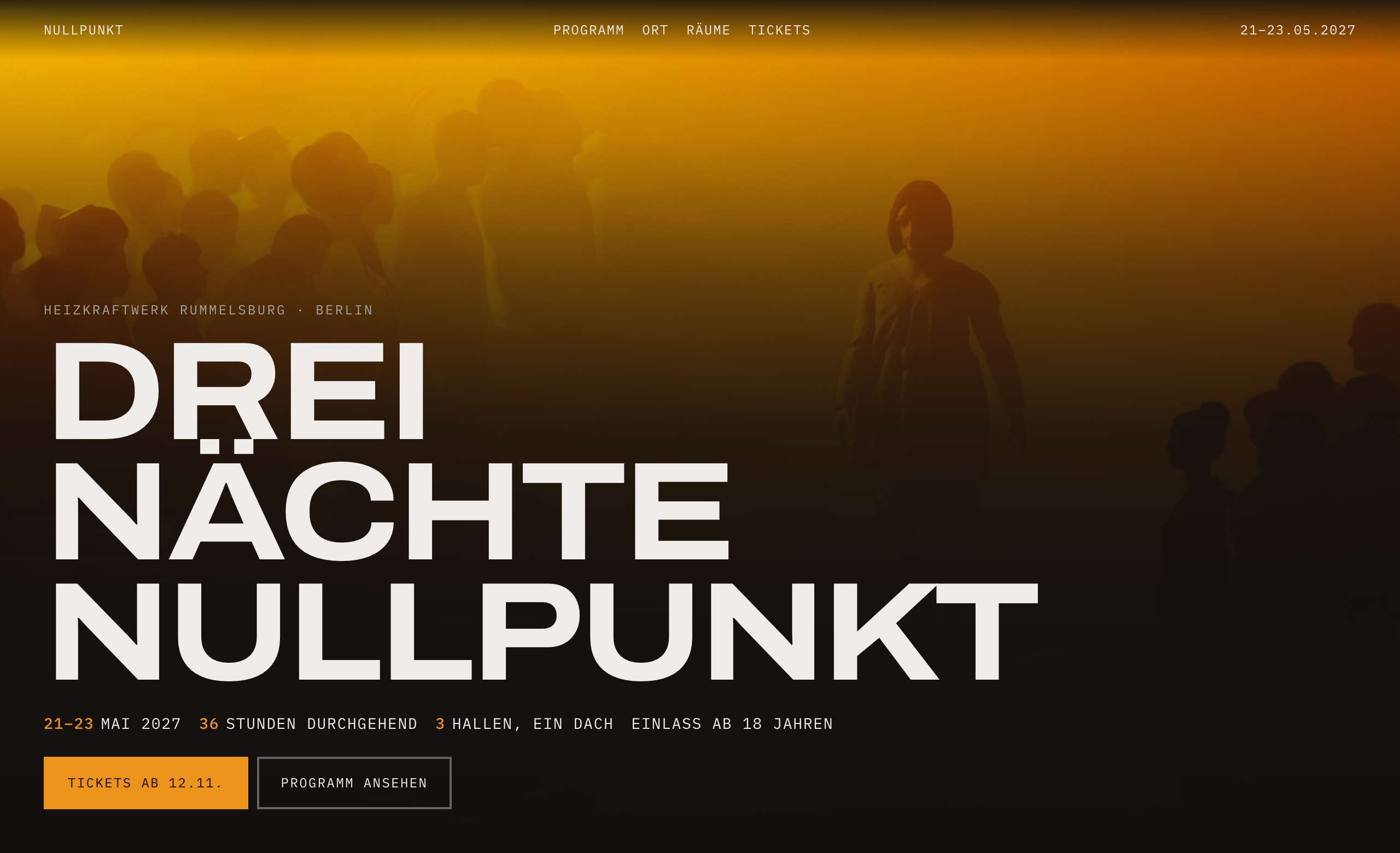
Register argued down from R4 because two of its five conditions failed: no film, no 3D. Sodium-orange hue taken from the photograph, Archivo Expanded over a full-bleed crowd shot, a night-by-night timetable that scrolls sideways, German copy with local ticketing conventions (Soli-Ticket, the official resale exchange).
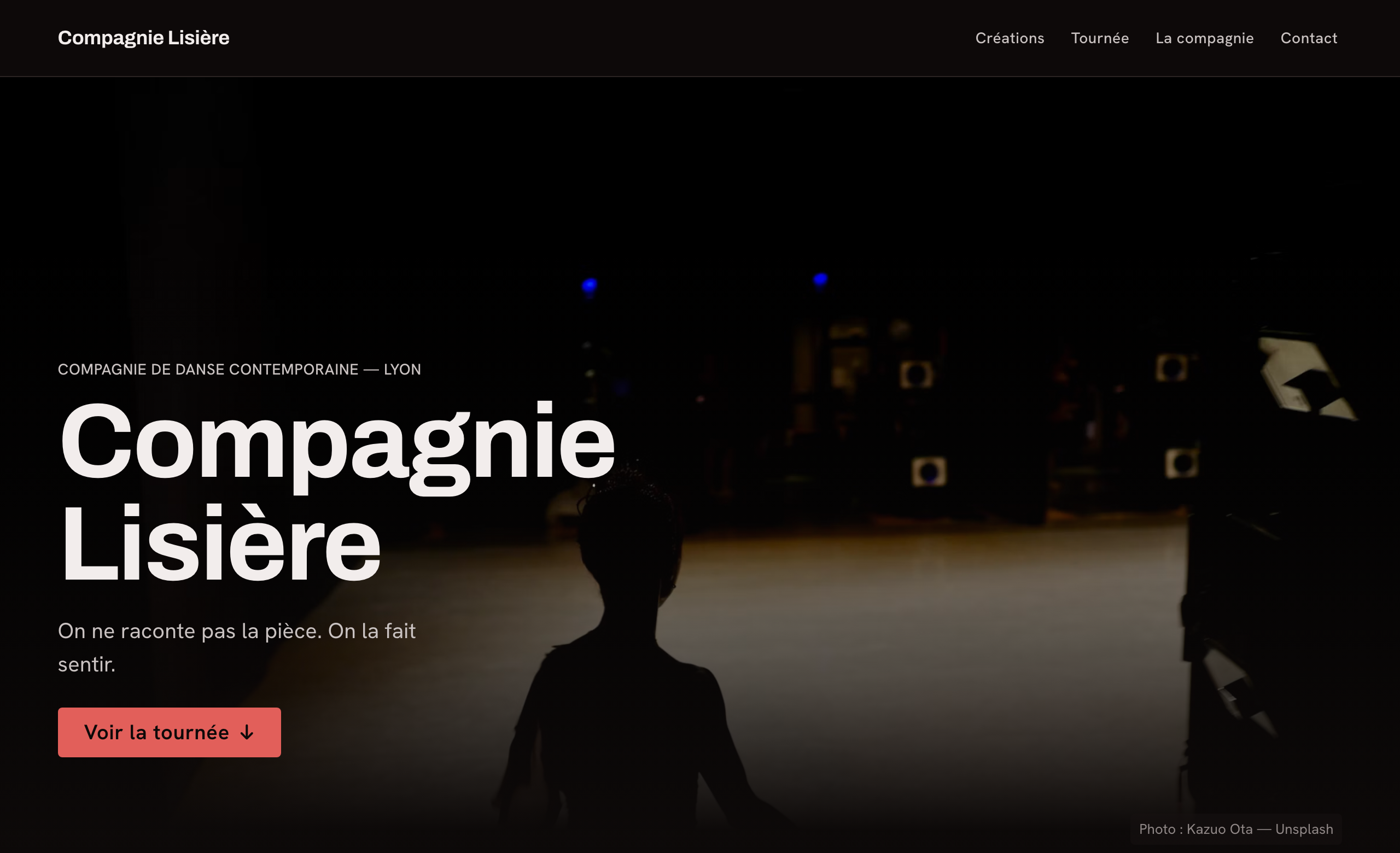
Proof the workflow survives a smaller model: four intake answers, a defended register, French copy, an ember hue referenced from the Opéra de Lyon. It also shipped an auto-scrolling marquee for tour dates with a thematic excuse. The catalog had banned that since 1.0 but nothing checked for it, so the run bought a linter rule and the page now grades C. Field tests are supposed to cost you something.
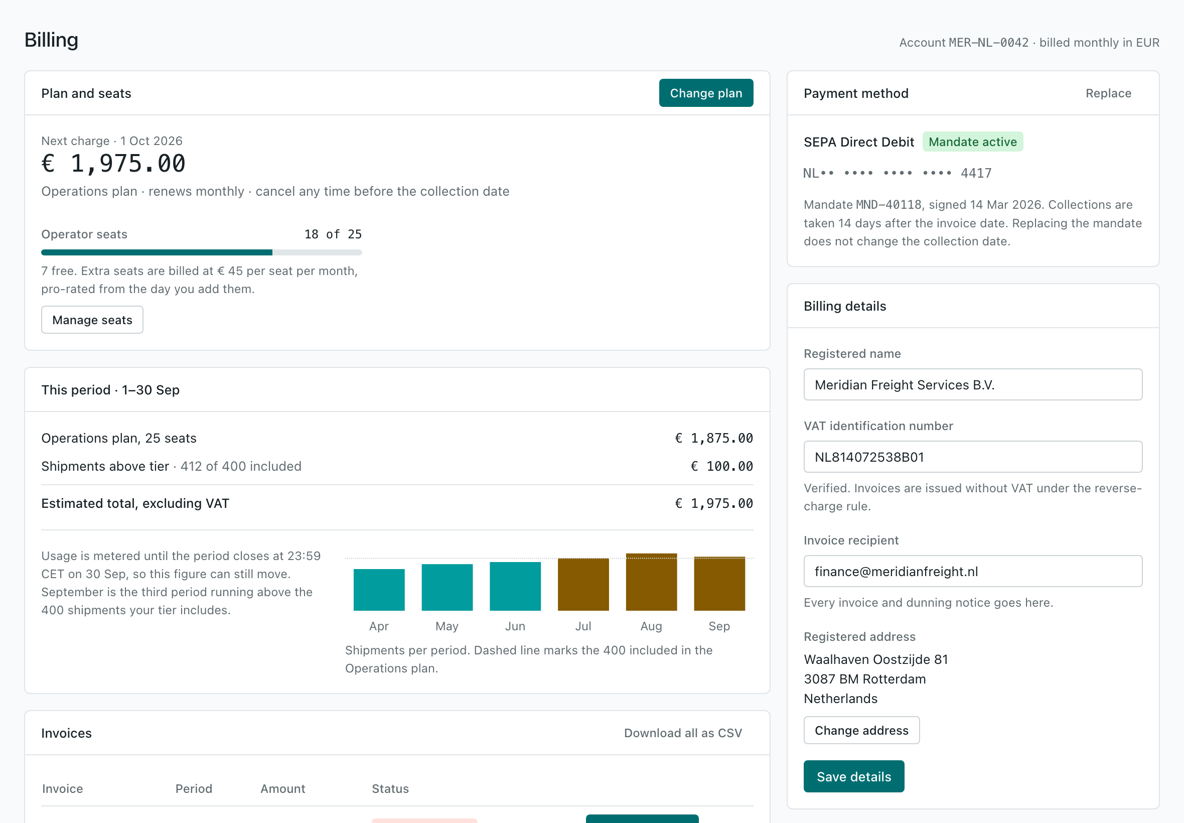
Detected a mature system, reused its components unchanged, added three through the project's own RFC process, and found a real WCAG failure in the host system on the way: white on the existing action colour measured 4.35:1, so every primary button in that app failed AA. Fixed at the token level, same hue, flagged as touching other screens.
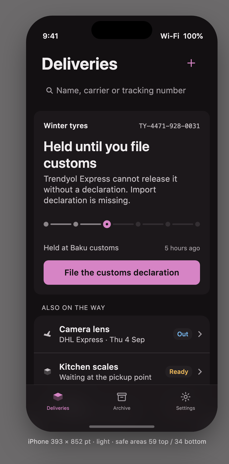
All chrome is system: TabView, NavigationStack, .searchable, .refreshable, inset-grouped lists. Liquid
Glass consumed, never authored, because glass belongs to the floating navigation layer and not to content. The
ambition went into the states nobody designs — customs hold, collect-by deadline, no scan in nine days, offline.
Tools
Stdlib Python, no installs. The skill runs these itself; you can run them on any codebase.
slop_lint.py <path> |
Scans HTML, CSS, JSX/TSX, Vue, Svelte, Dart, Swift and Kotlin for slop signatures and prints a grade with the catalog section to read. --json, --strict for CI. |
contrast.py |
WCAG 2.x and APCA for a pair, a pairs file, or — with --tokens — every text role on every surface role, in every mode. Exit 1 on an AA failure. |
build_tokens.py |
Compiles W3C DTCG tokens (aliases, *.dark.json modes) to CSS custom properties, Tailwind v4 @theme, SwiftUI, Compose, Flutter and flat JSON. --check validates and runs a palette sanity check. |
type_scale.py |
Fluid modular type scale with line-height and tracking per step. |
design_log.py |
Cross-project memory. Fingerprints each finished direction and warns before the next one repeats it — the per-project log is always empty exactly when convergence happens. |
audit_repo.py, selftest.py |
Maintainer tools, run in CI: the docs, templates and scripts must describe the same skill, and every rule must still fire on its fixture. |
Layout
SKILL.md          the router: what to do, and which reference to read at that step
references/       22 deep references, loaded per phase, never all at once
  discovery · existing-design-system · mini-user-research · moodboard · inspiration-sources
  expression-register · visual-material · anti-slop · design-tokens · color · typography
  spacing-layout · components · ux-patterns · content-microcopy · motion · accessibility
  web-frontend · mobile-ios · mobile-android · review-checklist · handoff
templates/        brief · DESIGN.md · assets.md · DTCG token starter set · contrast pairs · design log
scripts/          the tools above
evals/            four scenarios with rubrics, plus the fixtures the linter is tested against
SKILL.md stays a router under 500 lines; the depth lives in references/ and loads only when a phase needs it.
How it compares
Other design skills cover a slice: taste briefings with no workflow, style databases that still recommend glassmorphism, browser-audit monoliths with heavy dependencies, anti-slop catalogs with no research or tokens, token pipelines with no aesthetic opinion, UX method libraries with no visual opinion. The bet here is that slop is a process failure, so the fix is the whole process — research, direction, tokens, composition, review — with mechanical checks, for web and native, inside an existing system or from scratch.
What the field tests broke
Each version came from running the skill and looking at the screenshots, not from re-reading the documentation.
| Found by | Fixed | |
|---|---|---|
| 1.1 | Three briefs (dental, coffee, law) produced the same dark, serif, table-shaped page with no images | visual-material.md, market and design-system intake, local references |
| 1.2 | A competent page that still read as a document | expression-register.md, the photograph three-match test, an accent-hue check |
| 1.3 | A self-audit: the 1.2 rules were in SKILL.md but not in the templates |
audit_repo.py, selftest.py, CI, cross-project memory |
| 1.4 | An existing system, an iOS screen, and eval 04 on a weaker model | OKLCH silently dropped from the native token output, page rules judging component source, the unchecked marquee, register-aware budgets |
Full detail in CHANGELOG.md.
Contributing
Issues and pull requests are welcome, especially new tells for the catalog (with a source or a screenshot), false
positives in the linter, platform updates as the HIG and Material change, and eval scenarios that expose weak
spots. Run python3 scripts/selftest.py and python3 scripts/audit_repo.py before opening a PR; CI runs both.
Keep additions in the existing style: dense, numeric, tables over prose, no marketing language.
See CONTRIBUTING.md.
Licence
MIT. See LICENSE.
No comments yet
Be the first to share your take.